

Dash Pet Food Delivery App
A Case Study
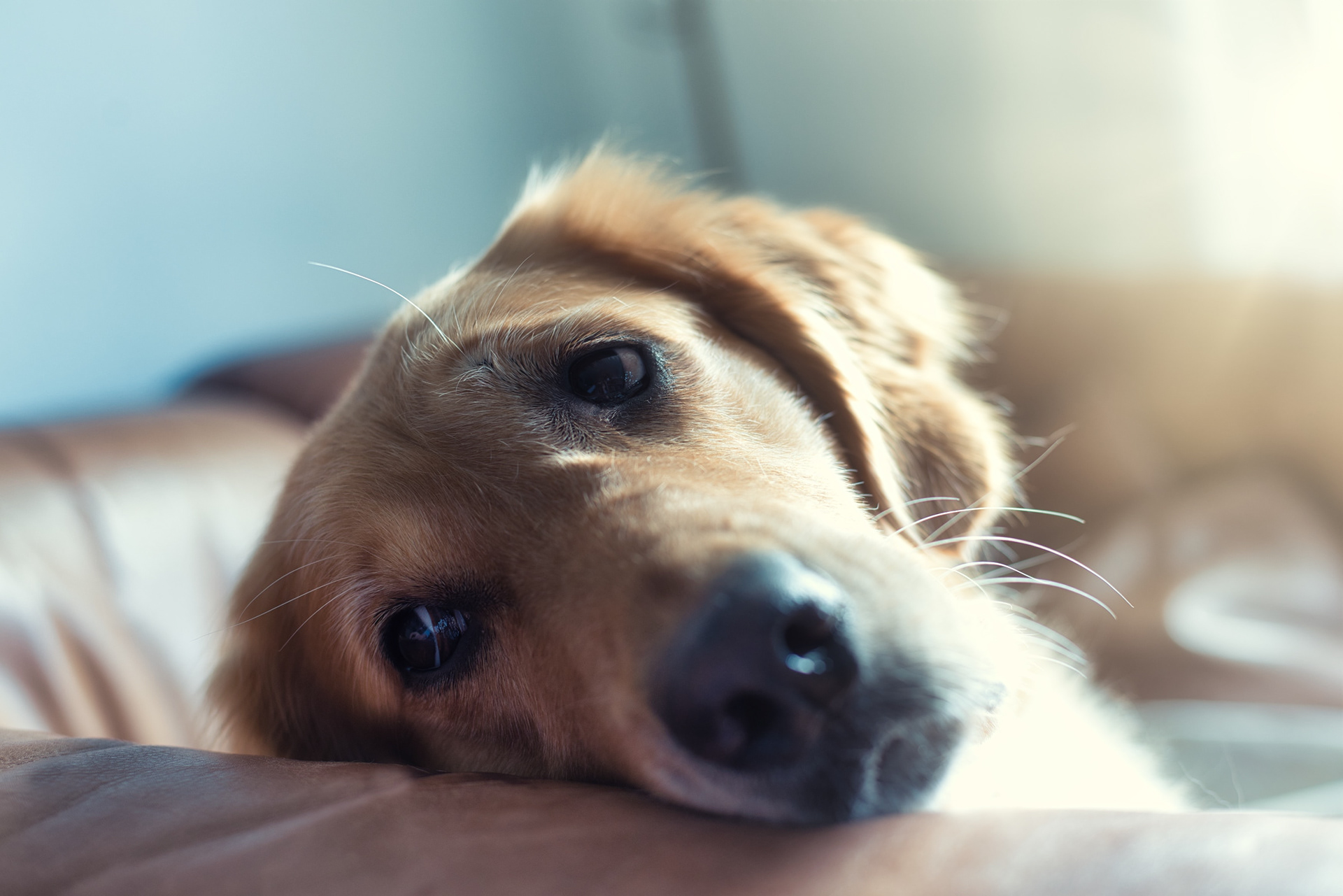
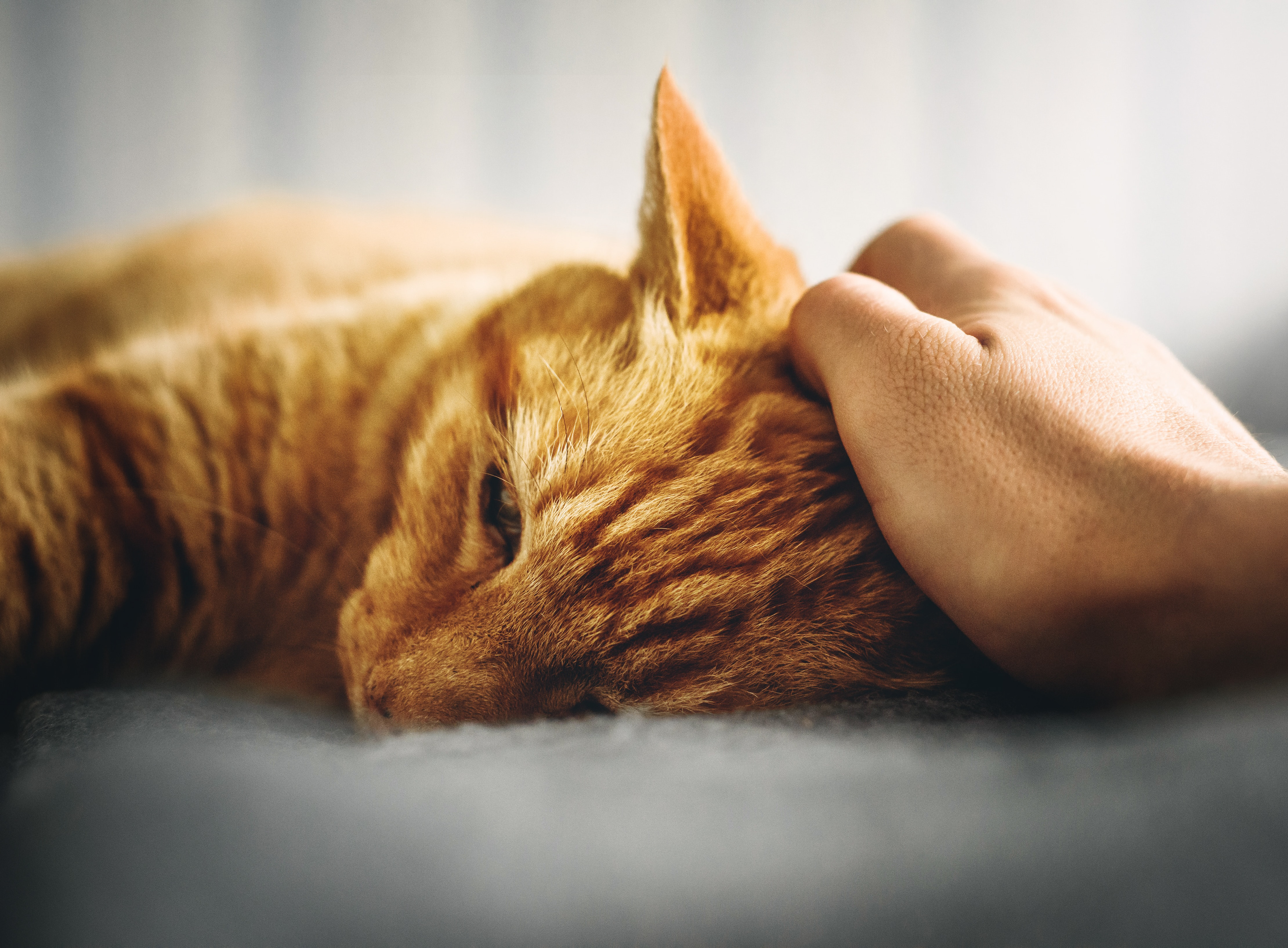
I created an on-demand pet food delivery app that gives dog owners a quick and easy way to order dog food, supplies, medication, and clothing

Dash Pet Food Delivery App
An On-Demand Delivery App for Pet Owners Who Can’t Go to the Store
Intro
Overview
We all love our pets, but unfortunately dogs and cats are too often neglected due to busy work/life schedules or the inability to go to a store. While there are already so many pet delivery apps out there, many of those deliveries take days or even weeks to reach the owner. It was clear to me that people need an on-demand delivery solution strictly dedicated to our beloved pets.
The initial solution was to create an app that allows users to order pet food and supplies and have it delivered to them, regardless if they need it in 10 minutes or in the middle of the woods.
Problem Statement
Pet owners that either live too far from stores or are too busy with work need a way to have their pet supplies delivered to them because too often are pets left home alone for long periods without nourishment and love.
Goal
The goal of this project is that my dog food delivery app will let users order pet food and supplies on-demand, which will help people who don’t have access to a store by giving them the ability to order quickly and efficiently. I will measure effectiveness by tracking order frequencies and the amount of repeat customers.
Target Audience
- People who don't have immediate access to go to the pet store
- People who have a deep love for dogs, cats, and animals in general
Scope and Constraints
Since it was just me working on this project, I could only do so much at one time. The majority of my time spent working on this project was at work - I had to balance this project and my work which was hard but definitely worth it.
Role
I worked alone on this project, so I solely carried out every part in this process - research; user research; UX design; visual design; and testing.
Timeline
Mar 2021 - Dec 2022
Design Process
I followed the Design Thinking process, so to kick off my research I began with interviews to better understand pain points and frustrations of what it’s like to buy dog food in person and through other apps. Upon completion of the interviews, I gained key insights into what types of users would be using this app and for what reasons. From this, I was able to create personas and journey maps.
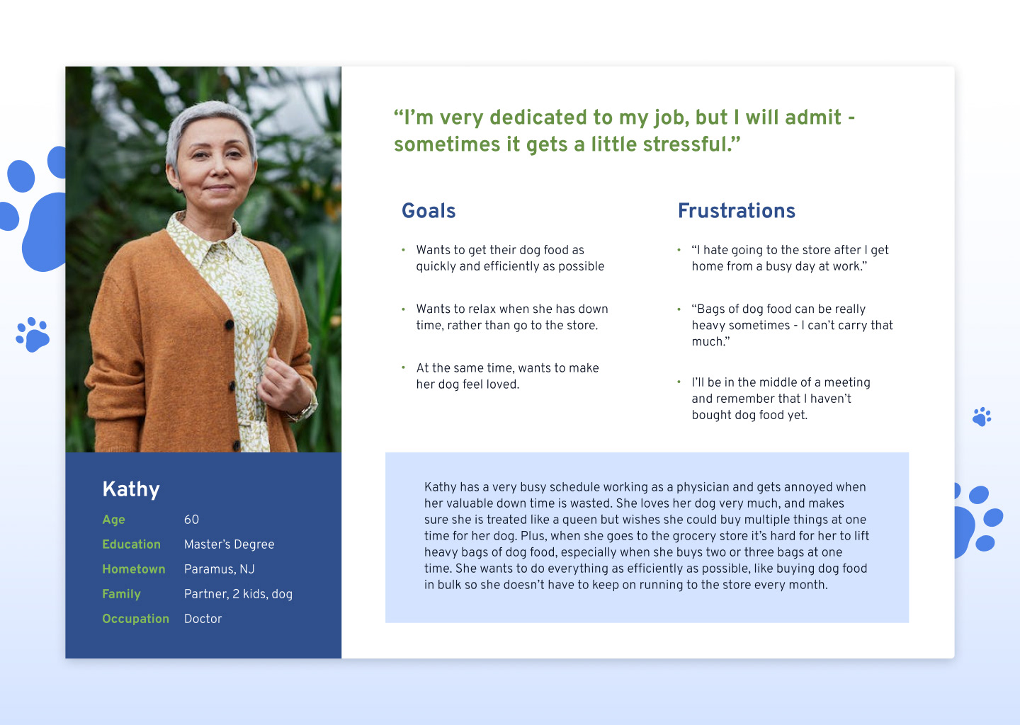
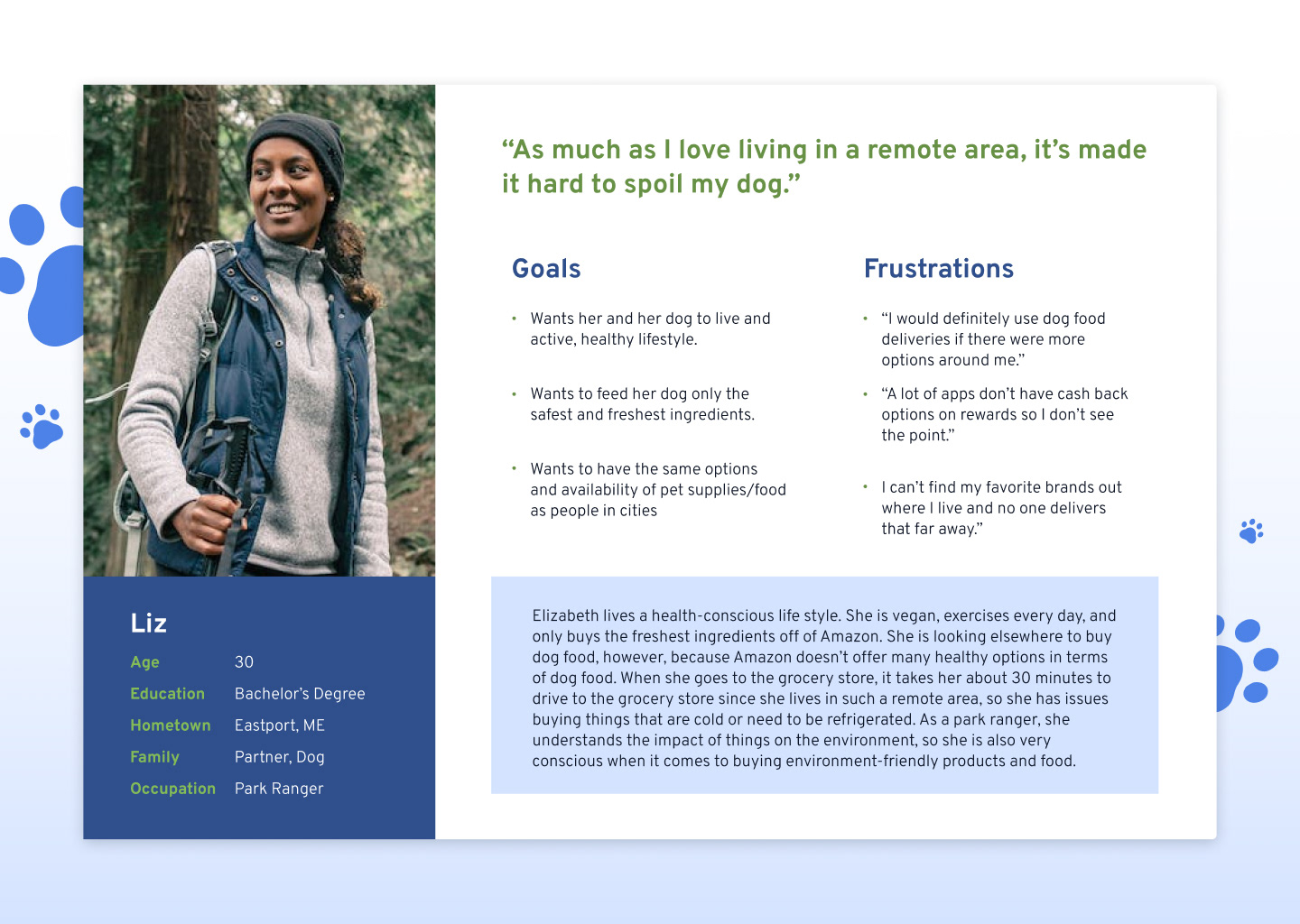
Personas
I created two personas - one describes Kathy, a very busy nurse; and the other describes Elizabeth, a park ranger who lives off the grid
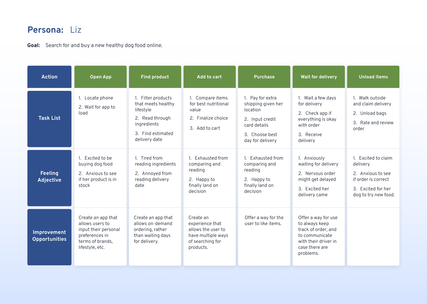
Journey Maps
I created two journey maps. One describes the process of a buying dog food in the store, while the other follows a user buying dog food online (in an app such as Amazon).

Competitive Analysis
I compared the companies that either directly sold pet food or supplies, and companies that delivered food and goods. My direct competitors were Chewy and BarkBox, while my indirect competitors were InstaCart, GoPuff, and UberEats.
Based on my research and competitive audit, I came up with my value proposition, which was that my app would offer on-demand ordering. Chewy offers food and supplies delivery but it takes a few days to get there, and BarkBox is a monthly subscription. One of the reasons InstaCart is so popular is because of it’s on-demand ordering system - so with this idea, I combined InstaCart and Chewy to make an app that has the largest selection (and niche items) of pet foods and supplies that can be delivered on-demand.
User Flows
I created user flows based on a user searching and finding a product and then finally ordering it.

Paper Wireframes and Digital Wireframes
I started out with Crazy 8’s to devise solutions to solve my problem. Based on my research on other dog food and delivery apps, I established that there would be a bottom navigation to help users navigate through the most important screens. I considered a search bar in my Crazy 8’s, but thought it wouldn’t be necessary as I put many options for product navigation elsewhere. Later in my usability studies I find out that users do in fact need the search bar.

Design Iterations
This section highlights the initial design iterations.
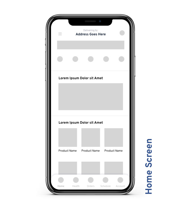
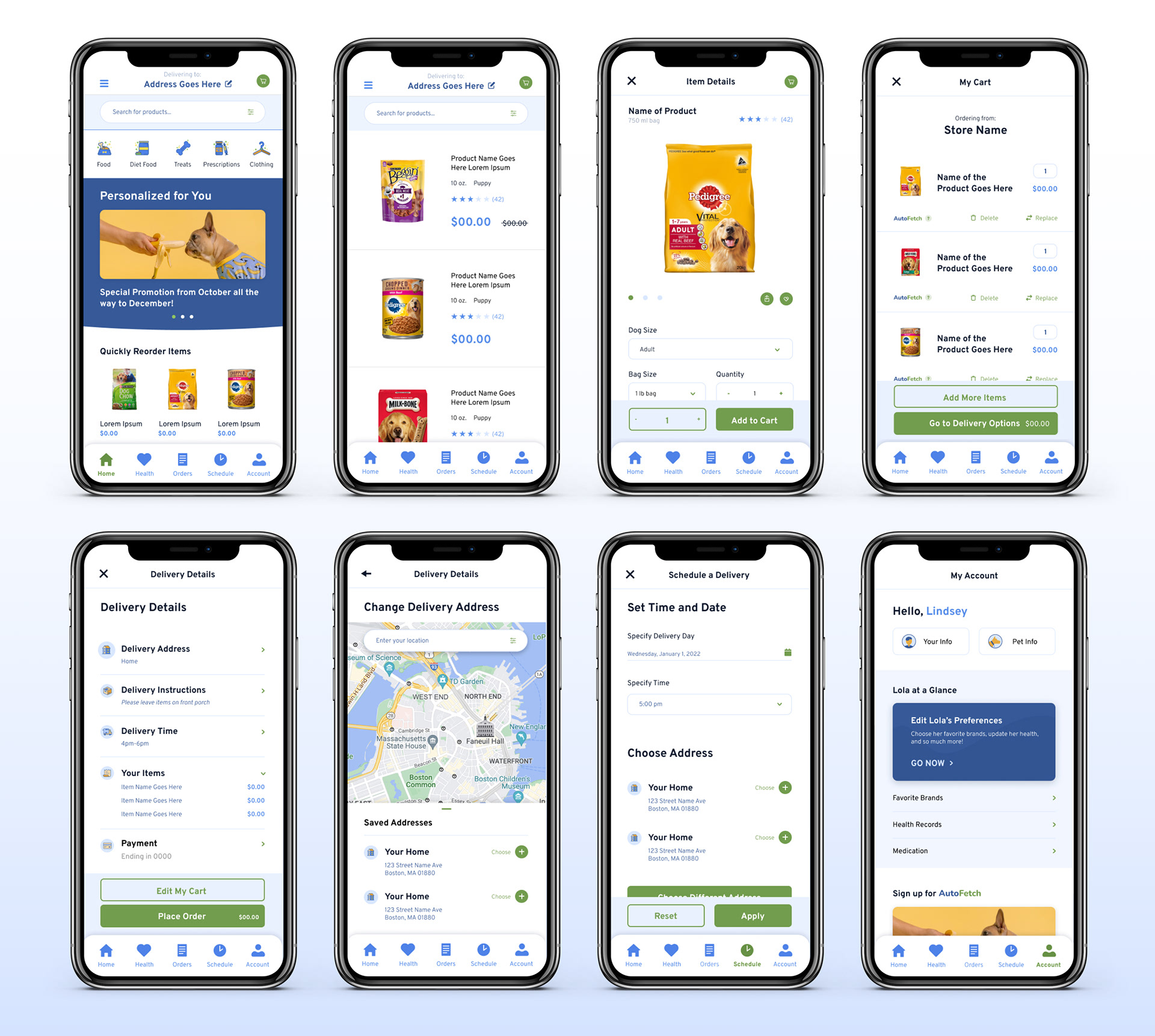
Home Screen
I wanted the home screen to be personally tailored to the user and their pet, this means stores nearby, favorite brands, quickly re-ordering, and suggestions. I considered how Chewy and BarkBox lays out their homepage - they too have a custom feed, but Chewy was far too focused on sales and promotions, whereas I wanted my app to show the love and dedication pet owners have for their pets.
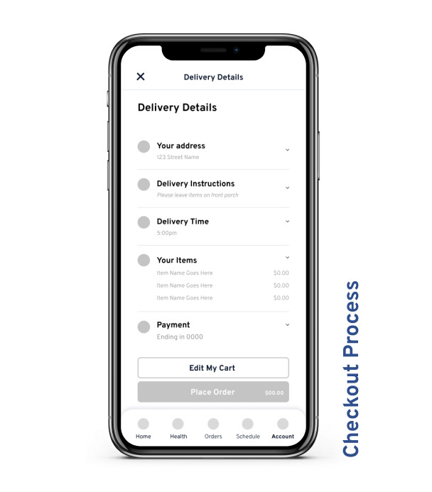
Checkout Process
As the user adds items to their cart, I wanted them to easily remove items and replace them if they accidentally removed it. This is why I added in confirmation screens after each delete from the cart.
I made sure to add a Delivery Details screen, similar to UberEats. This is where the user can confirm their address, delivery instructions, delivery time, their items, and payment method.Once they confirm everything and place the order, I included the ability to track their order. The user can see how many minutes away the order is, their items, and give them the ability to call their driver in case of any problems. I thought UberEats does this nicely - allowing the user to take complete control of their order if any problems arise.
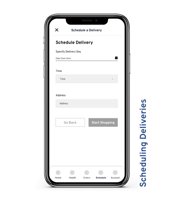
Scheduling Deliveries
Based on our persona, Kathy, who is a busy nurse, I figured users like her can benefit from being able to schedule a delivery and recurring deliveries.
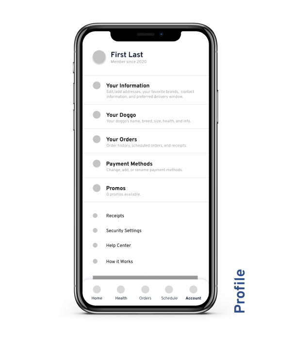
Profile
I broke the profile up into 5 main sections - Your Information (the user), Your Doggo (the pet), Your Orders (past orders), Payment Methods, and Promos. Within “Your Information” would be addresses, favorite brands, contact information, and preferred delivery windows. Within “Pet Information” would be the pet’s name, breed, size, and health.
Visual Design and Key Design Assets
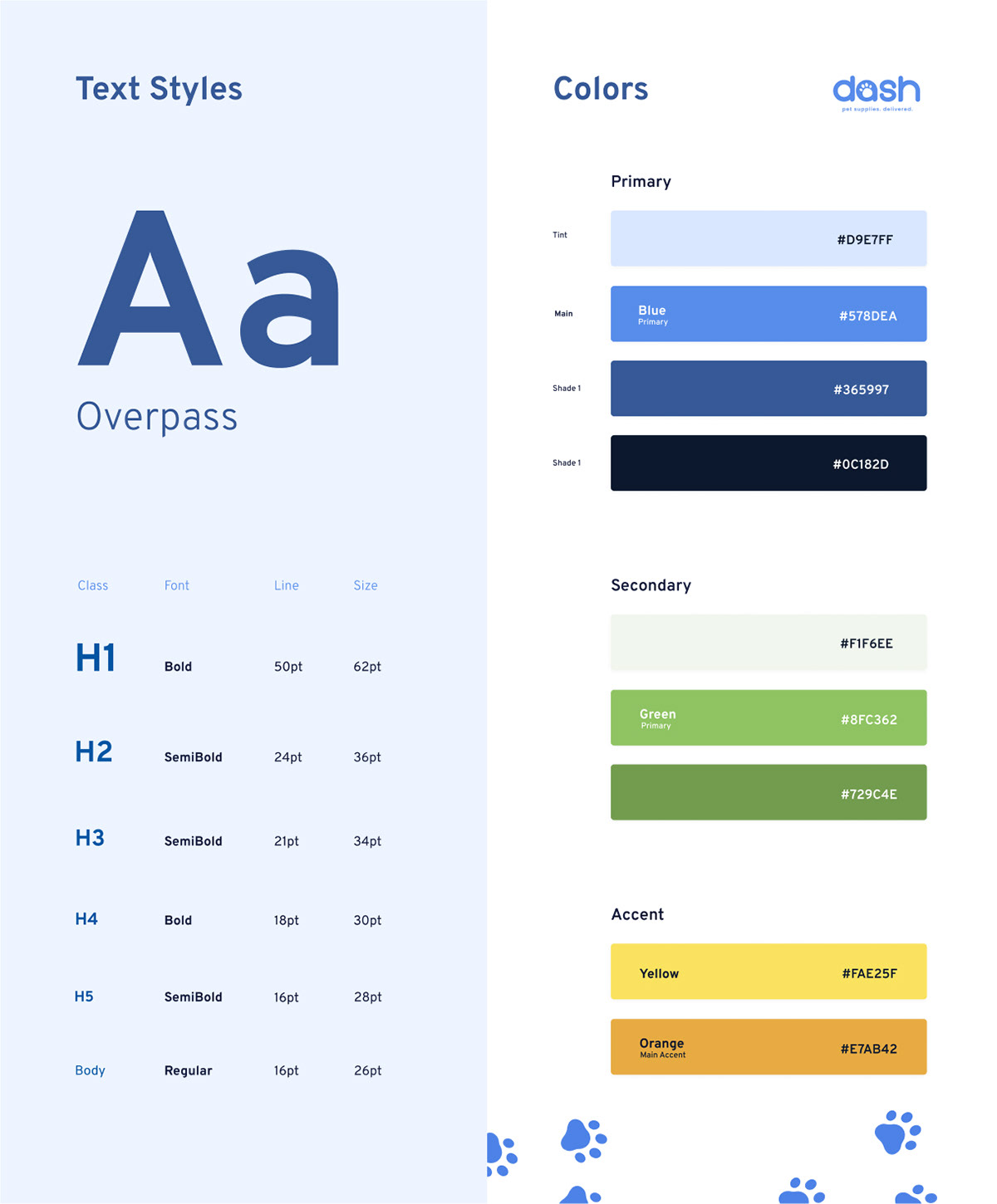
Typography
I chose a font that represented confidence and playfulness, which I established was going to Overpass.
Colors
I chose to go with a traid color scheme which consisted of blue, green, and yellow/orange. Blue was my primary color, green was my secondary, and yellow/orange was my accent.
Buttons & UI
Based on my color scheme and primary colors, I chose green as my button color. Keeping the colors consistent establishes a clear UI and lets the user know when something is a button. In all my visual design choices, I kept one thing in the back of my mind - confidence and playfulness. You can see this in the buttons as well - I kept the fill color very bold green to portray confidence but rounded the corners slightly to bring in the friendliness aspect.
Usability Testing
Usability Testing Research Methodology
To evaluate the effectiveness of personalizing the app and ordering deliveries, I decided to run usability studies with a select group of participants.
Each usability study followed this criteria:
- Moderated usability studies
- Remote (participants will go through the usability study in their own homes on their laptops or smartphones)
- Each session should last for 30 to 45 minutes
- Remote (participants will go through the usability study in their own homes on their laptops or smartphones)
- Each session should last for 30 to 45 minutes
Before each usability study began, I gave a 5 minute overview of the app to the participant - what the app is; why someone would use it; and what the competitive advantages are. I also made it clear that I wanted each participant to follow a series of tasks, and I reassured them that there were no wrong answers here so that they felt comfortable. After my overview speech I shared access to the prototyping link for the participants - I gave them a few seconds to initially react to the screens, but then quickly gave them their first task. Each participant got the same tasks, and the usually the same follow up questions. The only time they differed is if I had clarifying questions. I chose this moderated method because it gave me a much better understanding of exactly what they were thinking and feeling in the moment of frustration or happiness. Overall, I held 5 of these usability studies.
Although users were able to find products and order deliveries, they continued to struggle personalizing their experience, as well as searching for products. It was possible to navigate through to browse for products, but users found it difficult to search for very specific items.
"I wish there was some way I can input all of Casey's information before using the app, so I can see her favorite brands right when I open it."
- Usability Study Participant
Recruitment Criteria and Process
For this study, I was looking for users and non-users. I figured this would be the best approach to account for users who are very familiar with apps, and also users who possibly have never used an app in their life to see how they respond to the flow, information architecture, and experience. This made sure that I didn’t end up with biased data based on users who were “used to” normal flows.
Some of my recruitment criteria was:
- Owns a dog(s)
- Either has a very busy work schedule; or doesn't have immediate access to pet stores
- Ages between 18 and 65
- Has used a delivery service app
- Geography: US only
- Language: English
- Either has a very busy work schedule; or doesn't have immediate access to pet stores
- Ages between 18 and 65
- Has used a delivery service app
- Geography: US only
- Language: English
Because I was able to work on this project during work hours, I was able to find a few participants at my place of work. Luckily, two of them owned dogs. The other participants were family friends and personal friends who all met the criteria (one of whom is colorblind).
Key Insights from Usability Studies
1. Users want a clear distinction between their dog’s profile and their personal profile to better help customize their own experience with the app.
2. Users want an onboarding experience that allows them to input their personal and dog information.
3. Users expect a search bar and filters to help them with searching for specific products.
High Fidelity Prototypes
Click the link below to view prototypes. I have also included screenshots to show the finished product.
Reflections & Next Steps
Reflections
This project was an amazing project to work on. Not only was I given the chance to experience the empathetic mindset and process of a product designer, I was also able to successfully design an app that could actually help pet owners. I’ve learned so much throughout this experience - how to use different research methodologies; how to point out my own biases and understand how they affect design and data; how to research and understand users; how to define problems and goals; how to determine value proposition; the list goes on and on.
Although I am so proud of how this project turned out, I think back to certain areas and there are a few things I would probably do differently. In terms of constraints, I wish I had a more diverse interview group for foundational research and usability testing. Because I did this mostly during work hours, I think I convinced myself that my options were limited; where in fact, I could have used user testing sites like Usability Hub or UserTesting. Another thing I would have done differently is taken more advantage of paper wireframes - it’s easy to overlook this step, but I feel as if I spent a little more time in this area I could have saved time in other areas, like the prototyping phase.
Next Steps
If this was a real app that would be developed, there would be many areas to focus on and continue with. For starters, normally I would put together some sort of hand-off for developers - whether that be creating a design system, enhancing the style guide, or even doing a brief write-up of functionality. In terms of the app itself, I would continue designing and testing out other aspects and offerings of the app. In order to improve the app’s value and competitiveness I would like to include two services. One service focuses on pet health - users would be able to order medication through the app; have medication delivered; book appointments with their vet, and locate vets near their location.