

E-Commerce Redesign
UX Design, Data Analysis
Overview
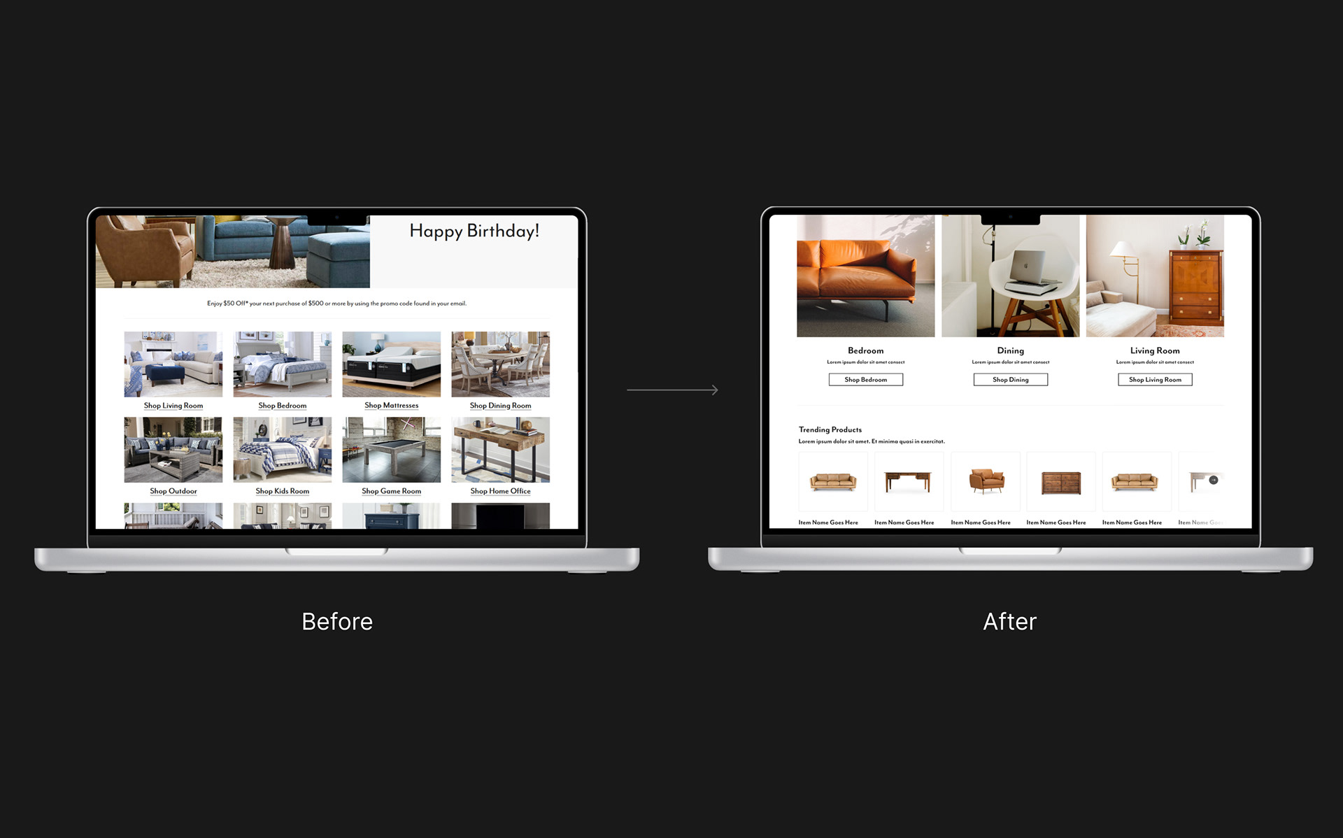
The goal of this landing page is re-engage customers after a long time away. We want this page to re-engage customers with the brand and get them back into the shopping experience.There were a few high-level problems we noticed right away. One problem was that users were facing too many options at one time - users were more likely to suffer from analysis paralysis, rather than navigate and make a purchase. Another issue we noticed was that the promo offer wasn't visible enough. This is what should be enticing the user, but it gets lost.
Collecting Quantitative Data
Before diving into the design, we needed to figure out how users were interacting with this page, in order to optimize their experience. Pairing with data analysts, we used Google Analytics and Glassbox to get insights into user behavior.
We also wanted to learn what users were shopping for with this promo offer, which is $100 off $1000 or more. In terms of savings, it's not a huge amount of money off. With this in mind, I was very curious to see what users were doing with this promo offer.
The following metrics were collected:
- The re-engagement email is sent out when a user is inactive on this website for more than a year.
- We collected all sessions over the period of 8 months. We collected interaction rates; bounce rate; transactions; customer journeys; and page views after landing on the re-engagement page.
Insights from the Data
Users were searching more than anything
What we learned is that users were mostly searching for items, rather than using the page's content. The search bar had the highest interaction on the page. This was surprising - the search bar does get high interaction overall, but it's usually middle-of-the-pack in terms of interaction rate. This led me to believe that users were either too overwhelmed with the page to do anything, or that the content on the page wasn't relevant to them.
Some of the highest searched terms after this page were fireplaces; coffee tables; and accents. With this in mind, this solidified my previous thought that the content on the page wasn't useful to the users.
Because users were searching for terms more than they were interacting with the rest of the page, this led me to believe that users wanted a more personalized experience. All the categories on this page led to parent pages, almost exactly matching the top navigation.
Users were going to lower-priced items
After looking at the pages viewed after this re-engagement page, it was clear that users were finding items that were lower-priced. (It's important to note that Living Room, Sectionals, Bedroom, and Dining are always at the top in any data analysis - these are the most popular pages and get the most revenue.) Items like sectionals and dining sets cost thousands of dollars. However, items like rugs, accent chairs, and sofas cost considerably less. This led me to believe that users are looking for an experience that shows more than just top-selling, expensive products. Users are looking for more reasonably-priced items. This answered my question I had about what users are doing with this promo offer - they are looking for less-expensive items, seeing as the offer doesn't take off that much money.
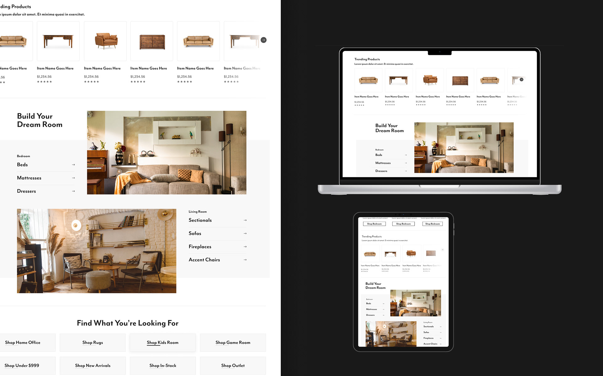
The Design Process
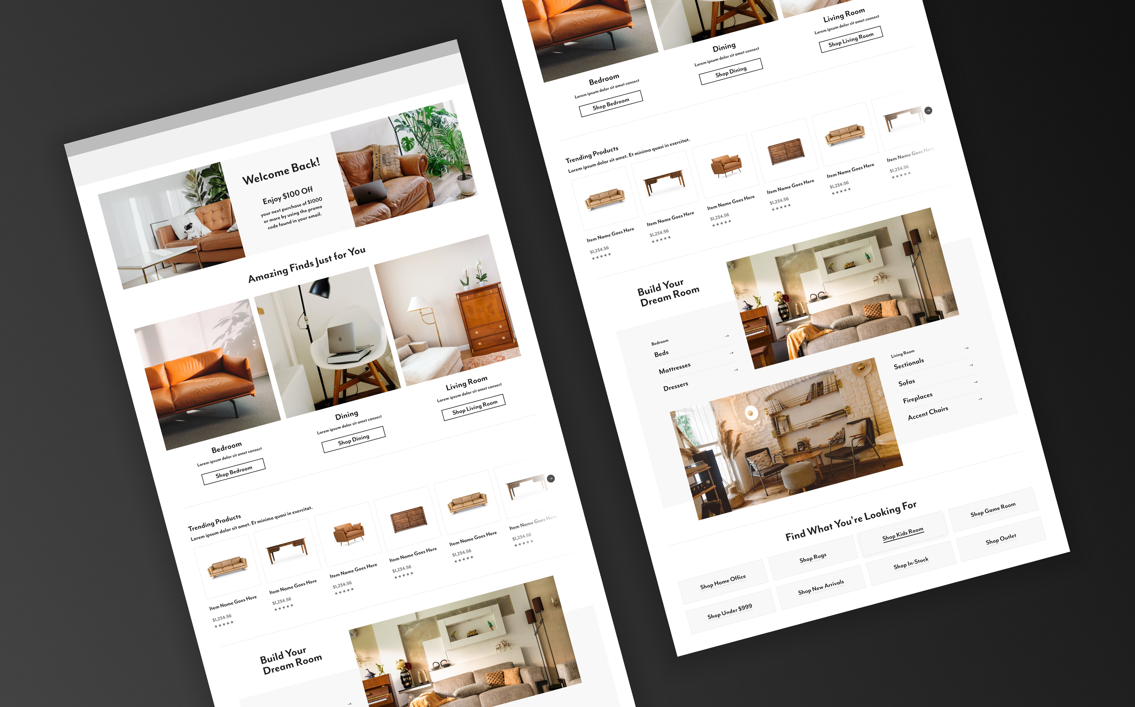
The new design needed a more personalized experience to let the user shop more realistically; as well as a more curated shopping collection strategically laid out on the page.
Showing the user more lower-priced items allows the user to envision realistic purchases that can be made using the promo code. I combined storytelling and UX design best practices to guide the user down a passage of realistic shopping. Each section of the page is meant to inspire the user, also while sprinkling in products to pair their imagination with tangible products.